55 Hi's has closed shop. Check out what Ross is up to now.

Posts tagged: limited edition screen print

The Ocean Alphabet Poster

These alphabet posters are just so incredibly fun to make, and each time we finish one, it’s our new favorite. This next one is no exception and we are so happy to introduce our new limited edition creation: The Ocean Alphabet. We teamed up with our friend and illustrator extraordinaire Dave Perillo to bring this poster to life.

This bad boy features killer whales, dolphins, and A NARWHAL as well as 23 other deep sea animals and underwater mysteries. Each letter of the alphabet is paired with an illustration and accompanied by a fun fact you can use to impress your friends. 

For instance, did you know when startled, flying fish are able to rapidly propel themselves out of the water and glide through the air with their wing-like pectoral fins. In the right conditions, they can soar along at 43mph, covering distances of over 1,300 feet!

Or that contrary to what their name suggests, killer whales are not actually whales at all. These marine behemoths are actually the largest members of the dolphin family and, much like other dolphins, are extremely social animals. They are sometimes called "the wolves of the sea," because of their pack-hunting behaviors.

Hammerheads have one of the most unique appearances of all sharks. Placement of the eyes on either end of their distinctive, hammer-shaped head allows them a full 360 degree view in the vertical plane, meaning they can see above and below them at all times. 

This poster is an 18x24, 4-color, Limited Edition screen print on thick Colorplan Turquoise paper that is hand numbered in an edition of 500. Every poster is printed by hand, in the USA, one color at a time & one sheet at a time.

Here at 55 Hi’s, we observe true Limited Edition. This means that once a poster sells out, no more are ever reprinted in any size, color, edition, application, or variation of any kind ever again. We believe this adds value and excitement to owning a piece of artwork and nobody wants what everyone has, right?


Making Of The Junk Food Calendar

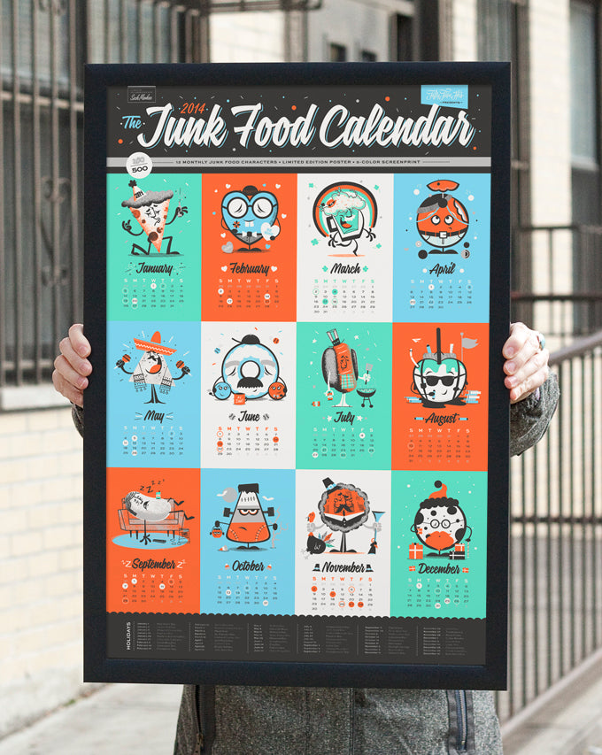
It's that time of year again! The annual 55 Hi's calendar is upon us. This year, after careful deliberation, we decided to go with the theme Junk Food, cause who can resist junk food every now and then? 

Chris Sandlin, the man behind SockMonkee, made a triumphant return to help us out again this year illustrating 6 of the characters for the calendar. It was great to have him back from two years ago when we did The 2012 Monster Calendar which was our first foray into this themed calendar business. 

Chris and I started talking about this late last year and we have been hard at work illustrating and designing these characters ever since. In case you aren't totally familiar with how our calendars work, each character is inspired by a well known event, holiday, or common theme of the month it represents. Chris and I trade off months with him starting things off with his Party Pizza Slice for January. We each do 6 characters and combine them to form one big calendar.

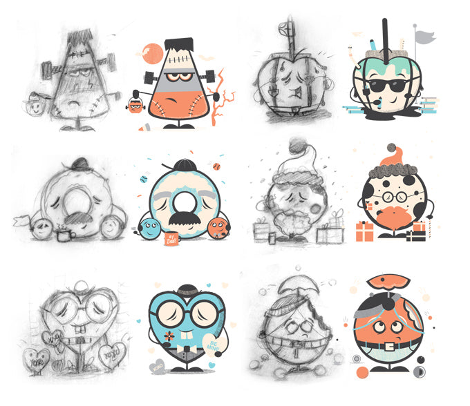
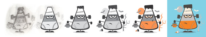
Process is always something I really enjoy seeing and throughout the drawing of these characters, I took screenshots so you can see the evolution of them being finished. Above are the sketches and final products for all my monthly character contributions. Clockwise from top left: Frankencorn, Back To School Candy Apple, Christmas Cookie, It's Raining Jaw Breakers!, Candy Heart Colin, and Donut Dad with his little donut-hole children. Below is some process of Chris's sketching for his characters.

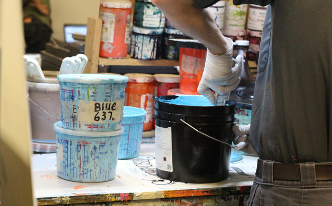
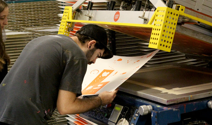
I suppose if you follow 55 Hi's at all, it's no secret that we work with Mama's Sauce for the printing of our goods. For this release, we asked them to do a little behind the scenes documentation and they were kind enough to oblige. The specs for this here calendar is a 16x24, 5-color screenprint on Sweet Tooth Paper from French Paper Co. Five colors is the most we have ever printed at 55 Hi's and it's been exciting seeing it come together one color at a time.

As you can see, these posters are printed the hard way. Each color is hand mixed and matched to a Pantone and then printed one poster at a time, one color at a time, while keeping a constant eye on the prints to make sure one of the seven million problems that can arise during screen printing aren't happening.

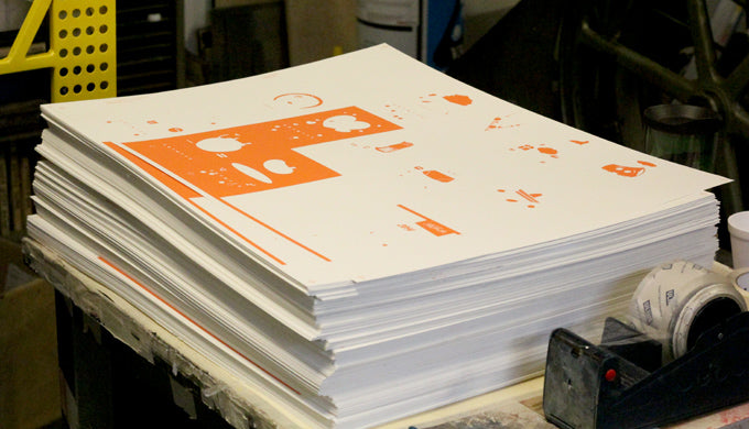
After you print the first color, and let the sheets dry, you put them in a an enormous stack like the one below, and get to printing again. Dry and repeat 4 more times. 

When I first started 55 Hi's, and did my own printing in-house, registering that many colors at once was a little out of my league. Each time a color is printed, if you are even a little off register, it effects how the color after it is going to sit, and if you mess up early in the game, you can end up with a whole bunch of misprints by the third color.

Now, we leave that sort of thing up to the professionals, and since it's not our arms doing the squegee pulling anymore, we decided to go all out and bring back a full palette of candy colored goodness.

Here are a few shots 3 & 4 colors into the process. With this particular poster, the black is really what brings everything together and the colors don't really look all that great, or even make sense, until the last color get put down. The black outline is always the most gratifying cause it feels like a magic trick after every pull.

You have this really intricate combination of colors that don't make any sense until the screen comes back up and you (hopefully) discover this polished piece of artwork. PACHOW!  That's what I used to say after every pull of the squegee. Ok, fine, I never said that once. You can see what I'm talking about below with the July's hot dog guy. He doesn't even have a face until the last step.

Once all is said and done, we get to trimming, numbering, and packaging! Since our Posters our now Limited Edition, we only print a set amount and that's it for the poster. No more in any color combo or edition will be printed. For these, they are limited to 500 and we hand number each and every one. 

We also decided to bring in a little twist (literally), and package up this special release in a Tootsie Roll inspired Limited Edition packaging. Each one of these is rolled up in a bright candy colored tissue paper and given a custom Junk Food Calendar packaging wrap. Many of these calendars get given as gifts for Christmas and what's better than receiving a tootsie roll Junk Food Calendar!

The Junk Food Calendars are available as desk models too. We had a lot of people interested in past calendars, but weren't able to take them home because of lack of wall space. Well this year, we decided to scale it down a bit and release a hangable desk sized version for offices or cubicles. Each calendar is trimmed down to 4 x 6.25 and comes with a black cotton cord for hanging.

The last item we're releasing today is one we have been getting asked about for a whole year. After the success of last year's Robot Calendar with Justin Mezzell, we decided to bring it back this year in a desk version! Robot Turkey is back!

West Elm Pop Up Shop & New Posters

If you are in the New York area this weekend, stop by and say hi on Saturday, July 27 from 1pm – 6pm in Dumbo to check out the Pop-Up Shop sponsored by Swissmiss & Etsy.  We will be set up down there hanging out and throwing cards at people. There will also be a Smilebooth, DJs and snacks. If you need more info, check out the Facebook Event Page. Should be a good time and it's never to early to get prepared for Christmas, right? 

A couple fun new posters just hit the shop also! Keep on Keepin' On and What's Cooking?  

What's Cooking is a kitchen themed print inspired by retro cookware. It is hand numbered and embossed in a limited edition run of 500. 


We also partnered with Help Ink to do a tandem release of our Keep on Keepin On design. We have partnered with Help Ink before to do a fun kids print that I believe is almost sold out! You can check that one out here and if you pick one up you're also helping a good cause!

National Stationery Show & Limited Edition Rules

We've been hard at work these past few months getting ready for a whole bunch of seasonal holidays and exciting events coming up! The biggest event, The National Stationery Show on May 19-22 will be 55 Hi's first trade show, and also the first big push into making it a full-time operation. It is quite an investment but no-risk, no-reward, right?

I have been visiting the Stationery Show the past few years green with envy over the amazing products and design that are showcased there every year. The picture to the left is one of my favorite booth designs from last year by OneCanoeTwo. We will be holding it down at a 6x10 corner booth, #1262.

55 Hi's started in 2010 as a simple creative outlet for me. I would make prints and cards at night after my job that I thought were funny in the hopes that other people would think so too. Almost three years later, things have taken on a life of their own and the idea of this becoming a full time commitment for me suddenly doesn't seem like such a pipe dream.

I think many people assume 55 Hi's is an established business with employees and a warehouse of inventory. It's not. It's just me, Ross. I work out of a one bedroom apartment in Harlem & I still have a day job. I hand-pack and process every order at night and I'm thankful for every single one. If you have ordered something or supported 55 Hi's, or even just read this blog post and thought good thoughts, thank you. Every bit helps and I am so thankful. 

I use the term "We" when referencing 55 Hi's because since starting it I have had the opportunity to work with an amazing roster of talented people. Just in the coming weeks we're going to have cards and designs coming from Joel Felix, Brad Woodard, and Riley Cran. If you haven't heard of any of these folks do yourself a favor and check em out.

We just finished releasing a few collaborative card efforts including Sexy Dyslexia, hand-lettered by James Edmondson & No Pants Dance which was crafted with awesome by Chris DeLorenzo. They had an amazing reception for Valentine's Day and if you had a good experience giving one, please share over on the Facebook page! The shame with making cards is I can never give them to my girlfriend, she critiqued them already.

This year we are getting prepared for Mother's & Father's Day with a few new card/print designs to be released next month. We're gonna pair one of the card designs with a limited edition print so if your mom needs a new decoration for the homestead, we got you covered. Here's a sneak peek, which is basically just the design and not a sneak peek at all.

One of the most exciting new avenues for 55 Hi's is that this year we will be branching into a few new paper products and not just cards/prints. Coasters, notepads, & possibly a few others miscellaneous paper creations are headed this way in 2013. The closest item like this to seeing the store is a new set of 6 coasters called" Pick Your Poison". The concept being that one side of the coaster will be a common drink recipe themed as a "Poison" and then the flip side is the "Antidote" or breakfast recipe that will cure your hangover from drinking too much of that drink. Below is one of the pairs of the set.

I have also been steady at work designing up a whole new set of Birthday Cards. Birthday cards are something I found myself personally needing, so if I needed them and I own a card company, I knew it was an avenue I was lacking. If you follow us on Instagram, you're probably aware of some of the sketches we've been floating into the newsfeed but here's one I'm particularly excited about.

Last but not least, we are changing the print model here at 55 Hi's moving forward. In the past, when it comes to prints and posters, we have released a general mix of limited edition, second edition, color variation limited edition, and open ended print runs in the shop. I believe that this is confusing to everyone and doesn't instill trust or value in the art. Prints are valuable to me because they are limited edition. And when a print says it is limited edition, that means it's the only runs of that print ever in any color combination or size. Therefore, moving forward, any print that 55 Hi's puts out that is limited edition, and they will likely all be limited edition, will be the only color combo and size of that print ever. Once it is gone, no reprint in any variation of any kind will be made again. We are also going to sell our current inventory of un-numbered prints and then they too will be gone forever. So technically they are limited edition now, but just no numbers on them cause I have no idea how many I have made.

To start this new limited edition print model, Live Well was just released into the shop. It is an 18x18, 3-color screenprint in a limited edition run of 300. It has a pretty slick spot varnish on the words dropshadow that catches the light. Check out more pics and closeups here.

As always, if you have a question, or comment, or just wanna shoot the shit and see a picture of my puppy that we just got in December and pooped on my carpet this morning, hit me up on Twitter or Facebook, or Instagram, or Email, or Fax, or Carrier Pigeon.

Sale

Unavailable

Sold Out