55 Hi's has closed shop. Check out what Ross is up to now.

Time for Some Real Talk

TL;DR - We're making shit again, and more of it. Sorry for the radio silence.

Let's Start at The Beginning

I thought it best, after a fairly long time of silence at the 55 Hi's camp, (and even longer since we've released anything but alphabet posters) to give a little peek behind the 55 Hi's curtain as to what I've been doing the last year or so.

Now, to start this blog post of truth off I feel it necessary (after 5 years of being fairly vague) to give a little context for the start of 55 Hi’s and the state of how I got to where I am now.

My name is Ross (you probably knew that). I’m the sole owner, original screen printer, designer, and general maker since starting 55 Hi’s in 2009. I think in the past, when people first encountered 55 Hi’s, they assumed it was a team of full time people cranking out prints and assembling stuff in a studio.

I intentionally gave off this vibe for a long time, cause I liked the idea of starting something larger than myself and also because I wanted to project a professional brand appearance and not what it really was (one dude hand printing posters out of a 3rd story walkup in Wilton, CT. and then walking to Fed Ex to cut them).

Working Full Time

Since the beginning, I have had (and still do) a full time job on top of 55 Hi’s. I do this for multiple reasons but the biggest one is that I like the ability to take chances and not rely on 55 Hi’s as my single source of income. It lets me take make things that I like (but may very well flop) without so much pressure and also allows the whole process of running 55 Hi’s to be much more enjoyable.

I have had a long standing fear that if 55 Hi’s were to become my main area of income, it would ruin the fun of it and it would become a job (which I already have). I can’t say it will always be this way, I’m just saying for my position right now, I enjoy the freedom that comes from not depending on this brand to eat and go to the doctor.

Quote Posters

Now since starting 55 Hi’s, over the past few years, I have let the standing success of the brand I had in the beginning (stylized typographic posters) dictate where it heads. I started 55 Hi’s making quote posters because I have always enjoyed witty sayings growing up. It was a natural progression to just try to make them look good. 

After a few years of this, and the whole quote trend becoming generally saturated in the design community, I started to feel like a Marshall’s sign department. Even though I was feeling this way, I also felt like I couldn’t stop because it was what people had come to know 55 Hi’s for.

Now, I have nothing against Marshall’s, or their sign department. In fact I just got some really great shoes from there at one hell of a bargain. It’s just not what I had envisioned when starting 55 Hi’s. To be honest, I didn’t even have a vision. I just wanted to make what I wanted. I figured, if I was going to have a job, I wanted to spend my own time making things that made me smile.

Getting Bummed

After feeling a little down, and a lot like a broken record of quote posters, I started to ideate around different products. I certainly have never had a shortage of ideas for new products, and since 55 Hi’s was feeling a little formulaic, I started to explore different avenues. The only problem was, all these ideas didn’t feel like they fit in with the strict limited edition, vintage-typographic, screen printed paper motif 55 Hi’s had become. I was really worried it would feel like it was coming out of left field, and the last thing I wanted to do was disrupt the brand and success it had seen up to this point.
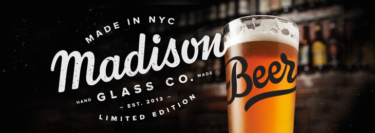
To combat this, I thought I would just start under new brand names. One of those avenues became Madison Glass Co. Another of those avenues became a handmade soy candle company called Wood & Penny. Another became a Button company called Really Bad Pins. Another idea became a hand made leather mousepad company called Rafter Supply Co. Then another idea I had became a tips and tricks blog for Shopify store owners. Lastly I had an idea for a dog bandana company that was sadly, never named.

Getting Confused

What ended up happening as you can probably tell, is, I started to confuse everyone (and myself). For instance, do I start a new twitter, facebook, and instagram account for all 5 new brands? Do I start from scratch for all of them even though the audience is all generally the same? If I start posting updates and pointing people to 5 different places from my personal social media accounts, will that be confusing? Especially since It’s all coming from me anyway!? Which one is the main one?

I kept spreading myself thinner and thinner as the months went on, completely flushing out these product ideas and brands, but then not having the capacity to properly maintain them. After more than a year of this, I became tired. I had worked for a long time, and generated a ton of things that I was tremendously proud of, and yet I felt like I couldn’t talk about for fear of confusing everyone. Something had to change and I had no idea what.

After letting the dust settle for a little while, I had a series of conversations with myself asking things like: what do I want? What do I enjoy? What do I want to do with my time? Why did I even start all these projects if they aren’t enjoyable? Do I want to be a manufacturer or designer? Printer or glass painter? Do I want to freelance full time or make products full time?

In asking myself all these questions, I discovered that I just like to make new things. It’s plain and simple. I just want to be able to make new things whether it be for kids or adults or dogs or ferrets without the fear of fitting into a strictly limited-edition hand screen printed poster brand every time. It’s an easy fix really, but one that I had a hard time making because I had traveled down so many separate avenues that I didn’t want to abandon.

But once I made the decision to bring everything under one roof, it felt like the whole world had been lifted of my shoulders. I felt like I could talk about what I was working on again and write about my experiences in a candid manner (which I have always strived to do with anything I’m a part of). This blog post is a perfect example of this and is the first positive completely transparent thing I’ve written in quite some time. It was the first time in 6 months I felt like I could post to my Instagram account without confusing the people who started by following 55 Hi's.

Moving Forward

Therefore, moving forward, a few things are going to change, but in the grand scheme of things, nothing that you haven’t already seen. Everything I’m working on (besides the candles) will now be under one roof instead of 5 different roofs all pointing at each other.


All my side projects are going to be gradually brought under 55 Hi’s and we will start releasing fun new things, more consistently. Some stuff will be extremely limited edition, some stuff won’t. It may be the most random product design you’ve ever seen or it may be cat bibs, but it’s going to be new and fun and interesting and that’s the point.

Well the not knowing what's coming next thing is a bit of a white lie. I do know that. We teamed up with Scotty Reifsnyder for one of the coolest looking posters and projects I've ever had the opportunity to work on. We're releasing it on Halloween (and rightfully so) cause if you can't tell from the teaser, it's a Mythical Creatures Alphabet Poster. 

55 Hi's Team

You can probably also tell I’m starting to refer to 55 Hi’s as “we” again. This time it's intentiontal and that’s because over the course of the last year or longer, I have teamed up with a long time friend Rick DiStefano for a lot of these new projects I have been working on and telling nobody about.

It’s been much more rewarding working with someone, as opposed to on my own all the time and it’s something that I want to continue with in this new direction. He’s coming on to handle a lot of the manufacturing and product fulfillment and we will be working together to try to make twice as many awesome things as before the short hiatus.

Casey Buckley

I had the opportunity to help out singer/songwriter Casey Buckley with a new logo for his upcoming marketing materials and brand. It's always fun when I get the opportunity to do little side jobs like this. Plus, it's even better when we can make something cool with it after. 

Casey's been writing tunes for the past few years and if you want to check out what he's throwing down, visit his soundcloud right here.  


My Big Mug

Very honored to be a part of Real Thread's Local Masters podcast this past week. Nathan, the man reppin' the mic over there, and I had a great talk that went all over the place. Thankfully, he edited my ramblings down to a nice digestible portion that focuses on entrepreneurship and doing what you love (but still having health insurance). 

Head over and give it a listen! If you get tired of me, there are some other really great convos to check out including Jessica Hische, collaborator Justin Mezzell and others...

ALSO! If you want to be a part of a soft launch currently going on that I'm a part of, head over to the all new Wood & Penny shop.

Wood & Penny is a small-batch fragrance house where we make quality, natural soy candles that inspire change and support the common good. The fragrances are hand-blended in all natural soy wax and packaged in stylish, reusable glass containers. Each candle is hand-poured with care and features vegetable cured cotton wicks.

To see the full rundown on how the candles are made or to get a little more information on the backstory and initiatives we are currently helping, visit the site! Suggestions are always, always very welcome and if you choose to support us, we thank you!

Bugs Alphabet Poster

We are back in action with the newest addition to the Alphabet Poster series! Bugs!

Ants, Earwigs, and Butterflies! Brush up on your ABC's with this jam packed poster featuring 26 different creepy crawlers and buzzing bugs from all over teh world. Each letter of the alphabet is paired with a custom illustration from our friend Brad Woodward and accompanied by a fun fact you can use to impress your friends.

For instance, did you know that a Goliath Beetle, when measured in terms of sheer size, bulk, and weight ranks among the largest insects on the planet. They are massive, sturdy creatures that grow to over 4 inches in length and can weigh up to 3.5 ounces. That's huge!

Or that that the Atlas Moth sports the widest wingspan of any moth in the world, with some spanning over 10 inches wide. The tips of their wings also carry an uncanny resemblance to a snake’s head, earning them the nickname “snake’s head moth.

Alphabets!

This is slightly dated news, but none the less exciting! We teamed up with our good friend Lydia Nichols again to present the next addition to our line of Alphabet Posters, the Circus! There is all kinds of fun stuff going on here and this poster has some of the most interesting and peculiar fun facts of any of the poster so far. Two in particular I found really interesting.

Whenever there is a picture taken of an elephant during the show, the position of its trunk is incredibly important—at least to the more superstitious circus goers. Capturing a photo of an elephant with its trunk lifted high in the air is thought to mean good fortune for the run of the show.

Or that today, many acrobats are trained professionally in specialized schools, but in older traditions, these remarkable athletic skills were all in the family. Throughout history, family circuses kept their artistry alive through generations by passing knowledge down from parent to child.

We're also excited to introduce a small teaser from the next upcoming addition the series, Bugs! After two amazing collaborations on Space and Dinosaurs with illustrator extraordinaire Brad Woodard, we couldn't help but team back up for this next one. All kinds of creepy crawlies are coming out. Beatles and Moths and Ants! Can't wait to share....


So Much New News

Oh mannnnnnnn. It's been a while, and you know why? ‘Cause I've spent the last few weeks mind-puking all the things I know about printing techniques in preparation for an exclusive class through Skillshare which can be found right here!!

The class, "Design for Print: Stand Out With Specialty Printing Techniques,” is now live and I'm super excited to share it with everyone. We’ll be covering all kinds of fun stuff like spot varnishes, edge coloring, duplexing, triplexing, sexplexing—the whole gamut. It's gonna be pretty introductory in nature, but even some seasoned designers can pick up some tips and links in there.

I also teamed up with the fine folks over at Mama's Sauce, who will be sponsoring the shindig. We're going to be creating business cards as the class project, and one lucky student project will be selected to get printed for FREE! If you aren't that one lucky person, don’t worry! You can still send it over to the Sauce for a cool 10% off just by enrolling in the class.

Ya know, it’s almost like I'm paying you to take the class. Quit taking advantage of me.

Another venture I have been quietly working away at is a new side project called Madison Glass Co.! Since the brand and products are new to all of us, I’ll introduce what’s going on and some things about it to get started. 

I love making paper products here at 55 Hi's but over the course of the last few years, I’ve really been interested in branching out and experimenting on some more practical and specialized items for the home. I feel like a lot of designers and websites out there make available every design imaginable as a print or poster and I really wanted to make something you couldn’t get anywhere else.

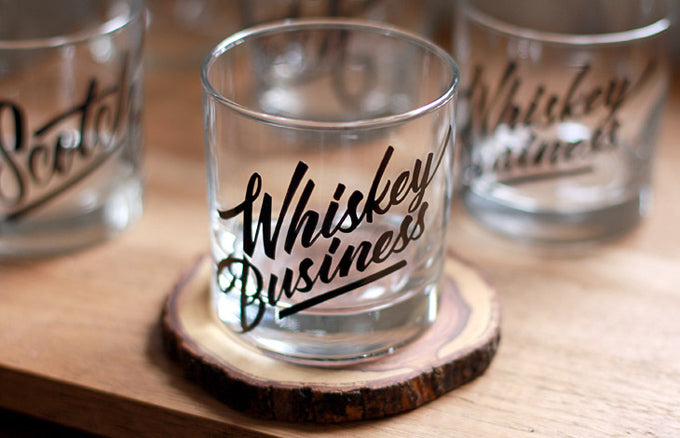
Originally, this was slated to be a limited edition jar brand. I liked the idea of jars and painting them, but it felt too narrow and therefore I ended up landing on glassware. Instead of trying to force glass products into the 55 Hi’s brand, which is a pre-existing Screenprint and Letterpress stationery business model, I decided to start new and create the brand you are seeing now, Madison Glass Co.

Another shift is the social media stuff. If you follow 55 Hi’s on TwitterInstagram, or Dribbble, you will notice (or have noticed) a small shift in the handle and description. In an effort to not be redundant, and constantly posting the same things to two different accounts, I decided to shift the handles to “_rossmoody” as opposed to a brand.

Since I’m the only person working at both companies anyway (and they are somewhat similar in content), I figured it best to not split up brand names quite yet and ask people follow multiple accounts for roughly the same updates. You were always talking to me before @55his but now I’m just a face instead of a logo. 

To give a little background on the birth of Madison Glass Co., I started toying with the idea of painting glassware in October of 2013. Having never made or seen anything like what I had in my head, I started experimenting with techniques I thought might work. Little did I know, it would become a nightly obsession for the next 4 months. A never ending valley of ups and downs from making sure the ink was dishwasher safe, to perfecting the technique of applying it to glass. 

A few variations (of the many dozen) include 5 different types of vinyl, 4 different types of paint mask, 6 different types of glass ink, varying degrees of baking cycles, solvent ratios, plotters, colors, ink transparency, indirect food safe concerns, paint brushes, airbrushes, HVLP paint guns, etching, sandblasting, packaging, shipping and an endless amount of other small concerns all went into the the endless pursuit for the best finish possible.

After weeks of dialing in the production method it was off to the races for putting the brand together. I brainstormed with my friend Rick over iChat for about two weeks on a name. A few early contenders were

• Levine Glass Co. • Amsterdam Glass Co. • Basic Glass Co. • Found Glass Co.

    I’d like to say I weighed all my options and picked Madison Glass Co. because of some extremely spiritual reason but I didn’t. Two things made the decision for me.

    1. It was the only available domain and handle for hundreds of brand names we tried.
    2. have a dog named Madison and she demanded we name it after her.

      For the logotype, I turned to long time friend, Riley Cran for help and was blown away by what he came back with. Armed with the communication “I want it to feel like a Marshall Amplification logo”, he came back with a better mark than I could even imagine. If you are unawares of Riley Cran’s work, check out some typefaces he’s designed on the Lost Type website he co-runs or give him a follow on twitter.

      Working is more fun with friends, so I asked a few more type-buddies to contribute some designs to the opening lineup.

      First up is a fun one from Ryan Hamrick. This was one of the first concepts I had for glassware when brainstorming the idea. He was kind enough to send over some in progress which is always fun to look at.

      We have a few amazing designs from Ricardo Gonzalez.

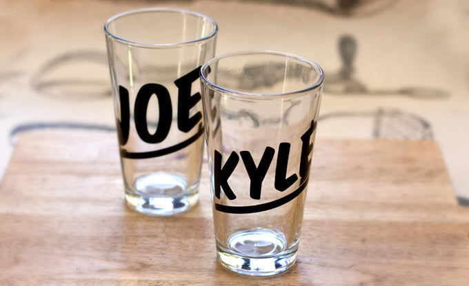
      Another fun idea I’m excited to share is custom glassware. The jist with these is customizable pint glasses in varying typefaces. In the listing you can put in any name under 10 characters, and using the typeface (plus any attractive ligatures!), I will create a custom pint glass. Birthdays, weddings, or craft brew fans might dig a glass with their name on it! Or you could ya know, do what I would do and just put “Dickbag” on it and give it to a friend.

      I'm also excited to start work on some custom glasses! For he first ever custom glass, we teamed up with the dudes over at TypeFight to bring a custom glass for all the winners! Should you win your bout, you get a hand painted gold goblet of glory featuring the TypeFight logo.

      If you have an idea on a custom glass you were thinking of, please let me know! 

      There are so many fun things planned for Madison Glass Co. I can’t wait to share them all with you and I hope you can’t wait to check them out. I will be sharing new items on the blog so feel free to subscribe to the RSS feed, or check out TwitterFacebook, or Instagram.

      This is all new territory and if you have any suggestions or ideas, please do reach out and email me. I’m all ears and I would love to hear some feedback.

      The Ocean Alphabet Poster

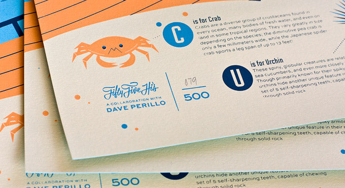
      These alphabet posters are just so incredibly fun to make, and each time we finish one, it’s our new favorite. This next one is no exception and we are so happy to introduce our new limited edition creation: The Ocean Alphabet. We teamed up with our friend and illustrator extraordinaire Dave Perillo to bring this poster to life.

      This bad boy features killer whales, dolphins, and A NARWHAL as well as 23 other deep sea animals and underwater mysteries. Each letter of the alphabet is paired with an illustration and accompanied by a fun fact you can use to impress your friends. 

      For instance, did you know when startled, flying fish are able to rapidly propel themselves out of the water and glide through the air with their wing-like pectoral fins. In the right conditions, they can soar along at 43mph, covering distances of over 1,300 feet!

      Or that contrary to what their name suggests, killer whales are not actually whales at all. These marine behemoths are actually the largest members of the dolphin family and, much like other dolphins, are extremely social animals. They are sometimes called "the wolves of the sea," because of their pack-hunting behaviors.

      Hammerheads have one of the most unique appearances of all sharks. Placement of the eyes on either end of their distinctive, hammer-shaped head allows them a full 360 degree view in the vertical plane, meaning they can see above and below them at all times. 

      This poster is an 18x24, 4-color, Limited Edition screen print on thick Colorplan Turquoise paper that is hand numbered in an edition of 500. Every poster is printed by hand, in the USA, one color at a time & one sheet at a time.

      Here at 55 Hi’s, we observe true Limited Edition. This means that once a poster sells out, no more are ever reprinted in any size, color, edition, application, or variation of any kind ever again. We believe this adds value and excitement to owning a piece of artwork and nobody wants what everyone has, right?


      Happy Holidays!

      Just wanted to take a second to thank everyone for the incredible Black Friday sale weekend and for showing an unprecedented amount of support for 55 Hi's. There are so many fun things planned for the coming months and your support is what makes it possible for me to continue making things, and I appreciate so much more than I can convey in a blog post.

      On the 55 Hi's news front, we have a few fun new things going on. Around 2 years ago I was asked by my buddy Drew Roper, Co-Owner of The Type Fight to contribute the number 12 in a bout against the crazy talented Justin Pervorse. Sadly, I didn't put up much of a fight and I ended up going home unvictorious.  I cleaned up my wounds and I trained exactly like this every day for a year. Now, we're back for Round 2! Below is my submission for the letter F (which happens to be my favorite letter). 
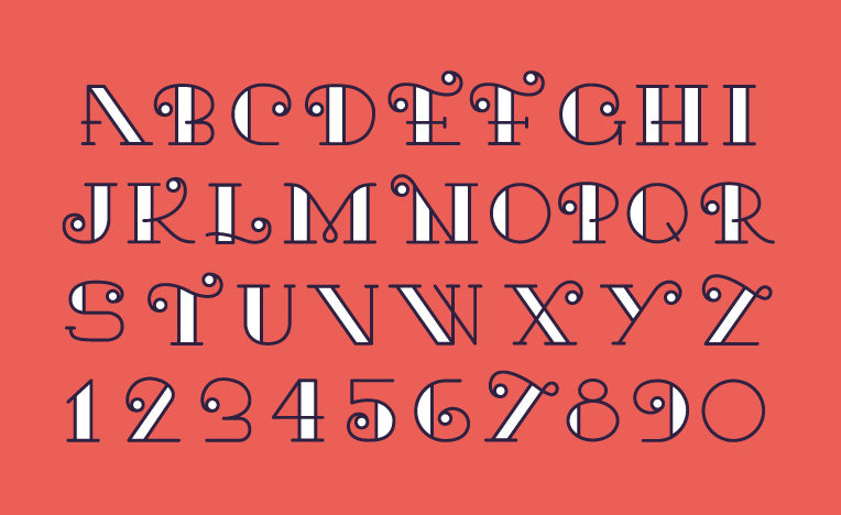
      The Type Fight Ross Moody

      Shortly after submitting my letter, I was contacted by a designer Javier Rivero, who was inspired by my letter and took it upon himself to flush it out into a display typeface! How cool is that?! He titled it "Kari" and it is available here!

      Kari Typeface


      Sale

      Unavailable

      Sold Out